A lesson in rebranding: USC2026
After consulting for the marketing team of University Startup Challenge last year, when I was tasked with taking care of its marketing strategy for 2026 as Marketing Director I immediately started thinking about making this year’s marketing impactful and meaningful.
I started working my head on things and I suddenly realised that one thing that could make the difference was our branding identity: a big change to hit the audience with and show a new face of the challenge, a more fun, playful, yet impactful one.
A challenging endeavour
🧠 It wasn’t an easy challenge for sure: rebranding always requires attention to detail, captivating the newcomers without leaving aside the people that were already interested in what you were doing, and without sacrificing the recognisability of the brand entirely, it very much resembles a life change in a way.
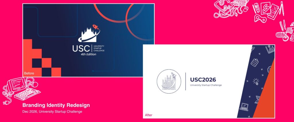
💡 But anything is possible with a vision and, while sylising complex architectures like Milan’s cathedral is certainly not an easy feat, I realised maybe the right direction would be to go against all trends. If logo design in the last 5 years resorted to simplification, geometric shapes and icons, maybe this case required breaking the “rules” and pursuing a specific aesthetic: and so, trying to mimic universities’ sigils, I went for an articulate design illustrating the old logo in a linear, yet fairly elaborate style.
What came out of the process
🎨 Along with the switch to coral red as the main colour of the scheme, the new brand identity is impactful, bold, yet classy and trustworthy. The association between the geometric linearity of Montserrat and the articulate illustration creates a striking contrast. An element I particularly liked developing was the icons, a visual element that ultimately became characterising for the identity as a whole.
🤨 Yes, it has its issues: the illustration is not easily represented on a small scale and it is a bit of a nightmare for embroidering, small print and other physical media (which is why a simplified version of the illustration exists). But the final result feels appropriate with the vision, is impactful and it manages to recall elements of the original branding identity without getting stuck on the old assets.